The following layouts were created by Ally exclusively for IHeartJake.com, unless otherwise noted.
• Main Site Layouts

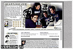
I didn’t save this one. It was my first real layout that I ever made in my life and it looked kinda funky. It was gray and it had a dark gray and light gray pinstripe back round. It was an OKAY layout lol but not one of my better creations. hehe
I would like to thank Jen for the graphic up top, she made it specially for the site! I made the layout myself. I was not experienced with iframes so i it was really really plain. Not my favorite layout but it did the job.
Yay! I loved this layout! I worked really hard on this layout and the pictures I used are 2 of my favorite Jake pictures! It was pretty simple but cool looking as well. I had this layout up for about 1 month. And it certainly did its job.
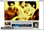
I loved this layout! It took me about 3 and half hours on photoshop. These pictures where so hot! I would like to thank Linda for those pictures too! <3 It was up for a while but then I got bored of it so I made a new one. Still I love it and I got many great comments on it.
These are 2 of my favorite Jake pictures so I just had to make a layout. I think it modernized the site but still made it classy. I liked the combination of colors I used! The blue and the gray just really went together. I loved this layout!
This was a very cute layout! I used old pictures but they looked amazing. I really liked how it turned out. It made the site look more modern and I really loved the colors I used but every great layout has to come to an end and yeah I got bored with it and made a new one.
This layout was my first one where I made a REAL blend. I used GORGEOUS pictures and I really just went crazy with them! I loved the colors and theme I used!
This was really funky! I really liked it and I liked the colors I used! The pictures are all really cute! This one was up for about 2 months and I thought that IHJ needed a change. All I liked about this layout was that it looked open and just funky!
I was actually just playing around with these pictures and I ended up with this AMAZING blend. So I HAD to make a layout out of it. The dark blue went really well and it had a classy yet modernized look to it. It was up for about a month but still a month well served!
I loved this layout so much. That’s probably why it was up for 2 full months. Every picture I used went perfectly together and I loved the color combinations. I got great comments on it but 2 months for me is a long time so I needed a change.
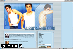
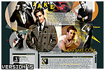
This one was very different from all the rest. I loved the picture I used and the colors. It made the site look more professional and unique from other fansites and layouts I had made in the past. This was up for a good 3 months and I’m really happy with the feedback I got on it.
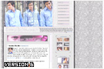
This probably has to be one of my favorite layouts so far. The pictures I used were just adorable and the style I used for the layout was very unique. I really had a lot of fun with it. The colors were also user friendly and went great together. This one was up for I think 5 months and for me that is just WAY to long. IHJ needed a change but I got so many great comments on it!
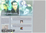
I liked the way the layout was laid out and I also adore the pictures used. They flowed together and so did the colors. This layout was darker than the others and had a greenish-tan feel to it. This layout was up for 2 months but it was too dark for spring so I had to change it.
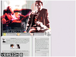
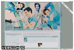
I came up with the concept of this layout in school while I was doodling (hey everyone does it!) Anyway I decided to use these photos because they have always been my favorite and they’re the first images I’ve ever bought of Jake from a magazine. The colors looked so great together and had a “handwritten” feeling to it. This layout was up for almost 6 months and IHJ needed a change.
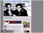
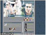
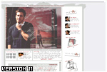
This layout was entirely inspired by the song “Circle Square Triangle” by Test Icicles. I don’t know why but listening that song made me think of lots of geometric shapes and bright contrasting colors. After the burst of inspiration I combined new and old photographs of Jake fused them together. The random black and white picture also gave the graphic a great medium. I’m actually really proud of this layout and hope to be that inspired again.
• Gallery Layouts
• Newspaper Layouts
Hmmm…. I didn’t really work that hard on this layout. It was really plain and simple. I made it in like 30 minutes though because I had to go to a friends birthday party lol And I guess I never fixed it :-/ I loved the picture I used though its another one of my favorite Jake pictures. Not my favorite layout though lol.
I loved the pictures I used for this layout they where so adorable. The only thing wrong with this layout was that the size wasn’t universal so it looked funky on other people’s computer’s. This was a great layout when it was viewed properly though.
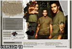
This layout was so awesome! I loved the pictures and everything! The required size for viewing this layout was 1024 x 768 but it still looked good. This was up for about 3 months yeah we needed a change. But all in all this was one of my favorite layouts.
Well stupid me forgot to cap the layout before I put the new one up… But anyways it had a plain grey backround and a picture of jake laying on the ground with leaves. The picture was very sexy but the layout was just too plain. The color scheme was grey and orange perfect for Autumn. But I got bored of it and made another one.
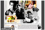
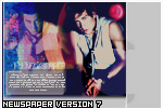
Bah!!! There is something wrong with me!!! I also forgot to cap this layout. This one sorta had a summery look to it even though it was winter. It was up for a while. I used the Arena Magazine Photoshoot for this layout and I must say that he pictures went AMAZINGLY together. It was cute.
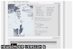
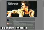
Yay! I Finally remembered to cap this layout! I loved this picture of Jake so I had to make a layout. It was simple and it looked nice. I had it up for a while but the newspaper needed an upgrade so I decided to change it.
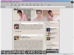
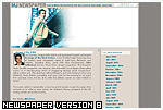
I don’t really remember this layout too well because it was only up for about 2 weeks. I think the pictures are GORGEOUS and that is why I made it into a layout, but I didn’t like the colors I used. It was too big and dark for the newspaper so I had to change it.
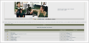
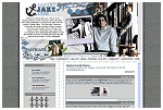
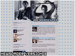
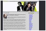
This lovely layout was simple and fit its purpose perfectly. The fact that it was so simple was great because the newspaper was basically just used as a news feed. The colors used went great with the graphic and I was pleased with the total outcome.
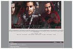
Another beautiful layout created for IHJ. This was the most recent (and last) layout used for the IHJ newspaper. With the switch to WordPress in 2011, it was no longer necessary to have a newspaper attached to IHeartJake. This part of the site was retired.